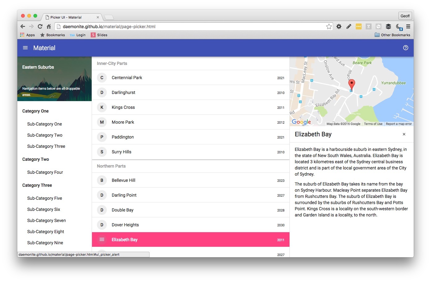
We’ve put together an awesome demo of Material for a complex desktop UI. The view emulates the Google Drive file management UI but can be used for any 3-panel view:
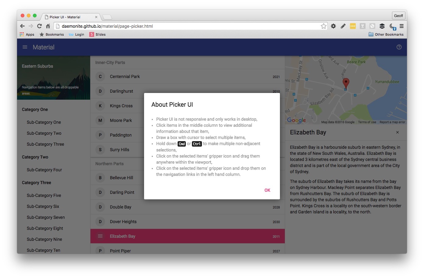
The basic premise is a category list on the left, records listing centre and a detailed property panel right. Selecting a record from the data list opens the detailed properties panel. In our example we have a Google Map and suburb information for Daemonite HQ.
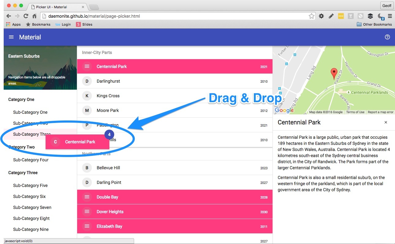
You can select for multiple records by using SHIFT, CMD or CNTR just like a multi-select control. Or even click-drag the mouse cursor to select a whole field of records.
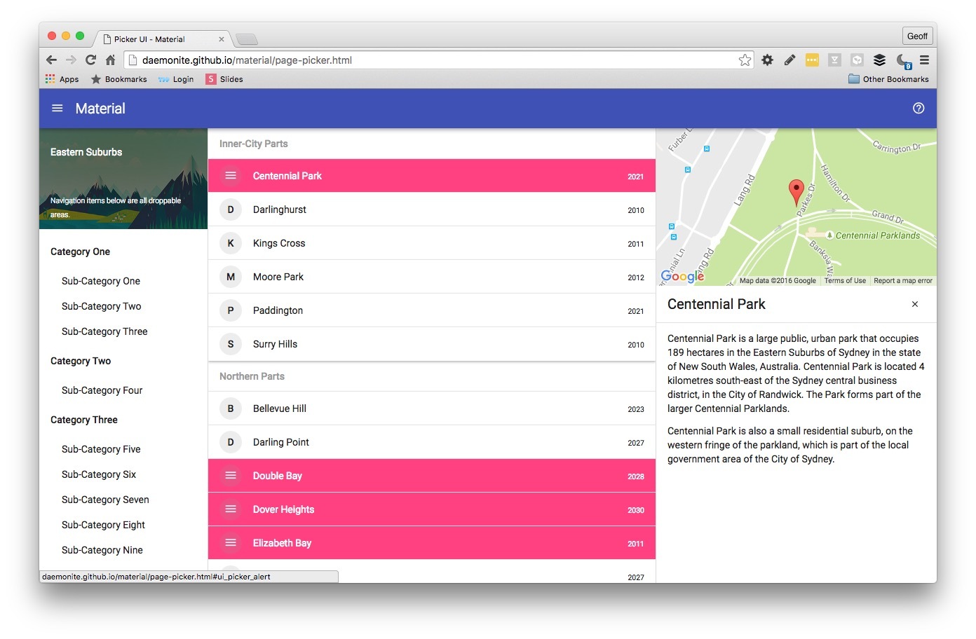
Highlighted records reveal a gripper than can be used to drag-drop the collection to one of the categories on the left.
There are many implementation options. If you have an interesting example, we’d welcome a pull request to add to our growing library of real world templates.
Enjoy!